Out-of-the-box metrics from integrations—like CPU usage or request latency—are great for giving you a baseline. They tell you if your systems are up and running, but they can't tell you if your business is actually succeeding.
This is where custom metrics come in. They bridge the gap between technical performance and real-world business outcomes.
Why Custom Metrics Are Essential
By sending your own unique data points from your applications and services, you can start tracking things that are specific to your business. This lets you correlate what's happening in your code directly with what your users are doing, turning a sea of numbers into something you can actually act on.
Imagine you just rolled out a new "one-click checkout" feature. Standard metrics might show that your server response times are fast and error rates are at zero, making it look like everything is perfect. But a custom metric could track the number of successful one-click checkouts compared to the old, multi-step process. Suddenly, you have real data that shows you how customers are actually using the new feature.
Connecting Code to Business Outcomes
This is the real power of custom metrics: they translate abstract events happening in your code into tangible business KPIs, aligning engineering work directly with company goals.
Here are a few scenarios where this becomes incredibly valuable:
- E-commerce: Tracking metrics like
cart.items.addedorcheckout.funnel.step_completedhelps you pinpoint exactly where users are dropping off. You could discover that 90% of users who add items to their cart proceed to the shipping page, but only 60% of those complete the payment step. This points directly to a problem on the payment page. - SaaS Platforms: Monitoring
user.trial.conversion_rateorfeature.adoption.countfor a new tool gives you immediate feedback on whether it’s providing value. For example, you might create a metricnew_dashboard.widget.createdto see if a newly launched dashboard customization feature is being used. If the count is low, it might signal a need for better user onboarding for that feature. - Gaming: Measuring
player.level.up.eventsorin_game.purchase.valuehelps developers balance game mechanics with monetization strategies. A practical example would be trackingin_game.item.purchase{item_type:power_up}versusin_game.item.purchase{item_type:cosmetic}to understand what kind of virtual goods are more popular.
This screenshot gives you a good idea of how you can pull all this data together on a single dashboard.
The key takeaway is how you can weave different data points—both technical and business-focused—into a single narrative that tells the complete story of your application's health and user engagement.
Datadog gives you the power to track what truly matters to your specific business. This lets you correlate custom data with the rest of your telemetry, moving you from just monitoring systems to achieving deep operational intelligence.
Before you start instrumenting your code, it’s critical to understand the four main types of custom metrics Datadog offers. Each one serves a different purpose, and picking the right one is key to ensuring your data is both accurate and cost-effective.
For more advanced setups, you might want to look into how something like the Datadog MCP server can fit into broader AI and data workflows. But for now, just know that choosing the correct metric type is the first and most important step.
Choosing the Right Datadog Custom Metric Type
To help you get started, here’s a quick breakdown of the primary custom metric types in Datadog. Think of this table as a cheat sheet for deciding which one to use based on what you want to measure.
| Metric Type | What It Measures | Practical Example |
|---|---|---|
| COUNT | Increments a counter over time. Good for tracking the total number of occurrences. | user.logins.total, api.requests.served |
| GAUGE | A snapshot of a value at a specific point in time. It can go up or down. | queue.size, active.database.connections |
| HISTOGRAM | Measures the statistical distribution of a set of values (avg, median, p95, max). | api.request.latency, image.upload.duration |
| DISTRIBUTION | Similar to a Histogram but for globally distributed values across hosts. | user.session.duration (aggregated across all web servers) |
Getting this right from the start will save you headaches down the road and ensure the dashboards you build are meaningful.
Instrumenting Your Application Code for Metrics
Okay, so you've pinpointed the business events you want to track. The next logical step is to actually teach your application how to send that data over to Datadog. This is what we call instrumentation—sprinkling small, targeted snippets of code throughout your application that emit custom metrics as events happen. It's the critical link that turns an abstract concept like "user engagement" into a hard, queryable data point.
The most common (and frankly, most efficient) way to do this is with Datadog's DogStatsD library. It’s a super lightweight, "fire-and-forget" client that sends metrics over UDP. This is a game-changer because it means monitoring has a virtually zero performance impact on your application. Your code sends the metric and immediately moves on without waiting for a confirmation, keeping things fast and responsive.
This simple workflow is powerful: your app uses the DogStatsD library to shoot metrics to the Datadog Agent running locally. The Agent then takes care of batching them up and forwarding them to Datadog's platform for analysis.
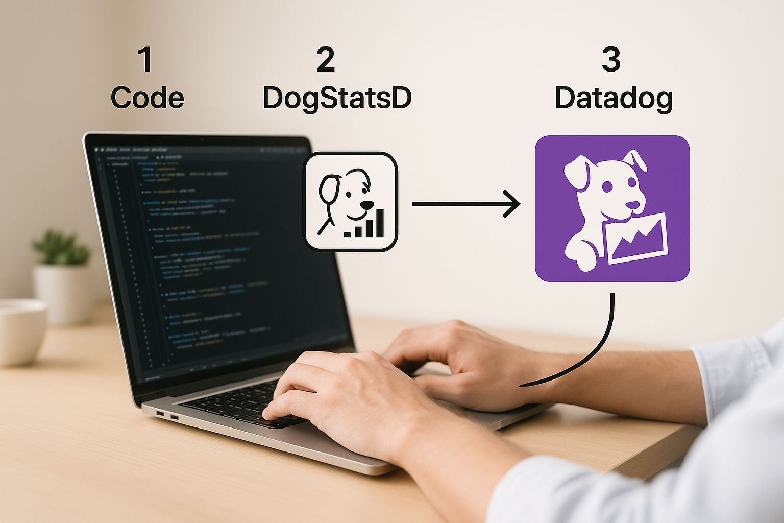
This diagram really highlights the clean separation of concerns. Your application’s only job is to emit the data. The Agent handles all the heavy lifting of aggregation and secure transmission, which keeps your application lean.
Practical Code Examples with DogStatsD
Let's get our hands dirty and see what this looks like in a few popular languages. The setup is almost always a breeze, usually just involving importing the library and initializing a client.
For a Python app, you'd start by installing the library (pip install datadog) and then put it to work. Let's say you want to track every time a user successfully uploads a profile picture.
Here’s how you’d do it with a COUNT metric in Python:
from datadog import statsd

def on_profile_picture_upload_success(user_id):
    # Increment a counter for each successful upload
    statsd.increment('webapp.profile.upload.success')
    print(f"Metric sent for successful upload by user {user_id}")
That's it. That single line of code increments the webapp.profile.upload.success counter each time the function gets called. Simple, right?
Over in the Go world, the process is just as direct. After grabbing the library (go get github.com/DataDog/datadog-go/v5/statsd), you could instrument your code to track something like API latency using a HISTOGRAM.
Here’s a Go example for a HISTOGRAM metric:
package main

import (
    "log"
    "time"
    "github.com/DataDog/datadog-go/v5/statsd"
)

func handleApiRequest() {
    // Initialize the DogStatsD client
    statsdClient, err := statsd.New("1227.0.0.1:8125")
    if err != nil {
        log.Fatal(err)
    }

    startTime := time.Now()
    // ... your API logic happens here ...
    duration := time.Since(startTime).Milliseconds()

    // Send the latency as a histogram value
    statsdClient.Histogram("api.request.latency_ms", float64(duration), nil, 1)
    log.Printf("Sent latency metric: %dms", duration)
}
This snippet measures how long an operation takes and sends it as a Histogram. This is awesome because Datadog automatically calculates the average, median, p95, and other useful stats for you.
The Power of Tagging Your Metrics
Just sending a number is good, but adding tags is where the magic really happens. Tags are simple key-value pairs that add context to your metrics, letting you slice, dice, and filter your data with incredible precision. A metric without tags is a single stream of data; a metric with tags is a rich, multi-dimensional dataset.
Think of tags as the "who, what, and where" for your metrics. A
checkout.successcount is good, but knowing which payment provider or what customer tier was involved is where you find actionable insights.
Let's go back to our Python example and supercharge it with tags. We can track successful uploads not just as a total, but broken down by the user's subscription plan and the image file type.
from datadog import statsd

def on_profile_picture_upload_success(user_tier, file_type):
    # Define tags to add context
    metric_tags = [f"tier:{user_tier}", f"file_type:{file_type}"]

    # Increment the counter with tags
    statsd.increment('webapp.profile.upload.success', tags=metric_tags)
    print(f"Metric sent for tier '{user_tier}' with file type '{file_type}'")

# Example usage
on_profile_picture_upload_success("premium", "png")
on_profile_picture_upload_success("free", "jpg")
Now, with these tags in place, you can jump into Datadog and answer some really specific questions:
- Are premium users uploading more images than free users?
- Are we seeing more errors when users upload PNGs versus JPEGs?
- What is the upload success rate for users in the
us-east-1region? (assuming you also add aregiontag)
By thoughtfully instrumenting your code with tagged custom metrics, you're transforming basic monitoring into a deep analytical tool that directly connects your application's behavior to real business outcomes.
Alright, let's get that data flowing into Datadog. Once you’ve got your application instrumented, you have two main paths to send those custom metrics: the Datadog Agent or the Datadog API.
Choosing the right one really boils down to your architecture. Most of the time, you'll want to use the Agent.
Pushing Metrics Through the Datadog Agent and DogStatsD
The go-to method for most setups is the Datadog Agent and its trusty sidekick, DogStatsD. Think of the Agent as a local collection point on your server or network.
DogStatsD is built for one thing: speed. It uses a "fire-and-forget" approach over UDP. What does that mean for you? Your application lobs a metric over to the Agent and immediately gets back to work without waiting for a confirmation. This asynchronous process is a huge win for performance, especially in high-traffic applications where you can't afford monitoring to become a bottleneck.
The Agent catches all these UDP packets, bundles them up, and then securely forwards them to Datadog in efficient batches. Instead of your app making tons of individual API calls, it just sends tiny, lightweight packets to a local process. It’s clean, efficient, and super reliable.
This setup is perfect for:
- Traditional monolithic apps on VMs: A practical example is a large Ruby on Rails application running on an EC2 instance. The Datadog Agent runs on the same instance, and the Rails app sends DogStatsD metrics like
orders.processedtolocalhost:8125. - Microservices spread across different hosts: Each microservice host runs its own Datadog Agent. This keeps the metric collection decentralized and close to the source.
- Containerized environments where the Agent can run as a sidecar or on the host node: In Kubernetes, you can deploy the Agent as a DaemonSet, ensuring one Agent pod runs on each node, collecting metrics from all other application pods on that same node.
The real beauty of DogStatsD is its resilience. Since it’s just sending a UDP packet, your application won't hang or crash if the Agent is down for a moment. The metric simply gets dropped, which means your application's stability is always prioritized over the telemetry data.
When to Go Straight to the Datadog API
While the Agent is the workhorse, it's not always practical. In ephemeral or serverless setups where you can’t run a persistent Agent, hitting the HTTP API directly is the way to go.
This approach shines in a few specific scenarios:
- Serverless Functions: For things like AWS Lambda or Azure Functions, you can fire off a custom metric right from your function code when it finishes running. A practical example is a Lambda function that processes images; after each run, it could send a
image.processing.duration_msmetric directly to the Datadog API. - Batch Jobs: Imagine a script that runs every hour to process data. Once it's done, it can push a quick summary metric like
batch.job.durationorrecords.processed.countdirectly to the API. For instance, a nightly financial report generation script could send areport.generation.success{report_name:daily_sales}metric upon completion. - Client-Side Applications: It's less common, but you could send metrics from a front-end app. Just be extremely careful with your API key management if you go down this path.
To use the API, you'll make an authenticated POST request to your region's Datadog endpoint. This means you need a Datadog API key, which you should treat like a password—store it securely, never hardcode it.
The trade-off here is that you're now responsible for managing API rate limits. The Agent handles all the aggregation and batching to keep you under those limits automatically. When you use the API directly, that responsibility falls on your shoulders. If you're interested in how other systems handle data ingestion challenges, you can see how a Prometheus MCP server tackles similar problems in a different context.
So, which one should you choose? It all comes down to your environment. For the vast majority of applications running on stable infrastructure, the Agent with DogStatsD is the clear winner for performance and reliability. But for those short-lived, serverless workloads, the API gives you the direct line you need.
Building Dashboards and Alerts That Matter

Getting your custom metrics into Datadog is just the beginning. The real magic happens when you make that data visible and, more importantly, actionable. A raw stream of numbers is just noise until you give it context. Dashboards turn that noise into a clear story, and alerts make sure you never miss a critical plot twist.
Your goal isn't just to slap some graphs on a screen. It's to answer specific business questions at a glance. Think beyond a generic CPU chart. Imagine a dashboard that overlays your custom cart.abandonment.rate metric right on top of your backend API latency. That simple visualization can immediately show you correlations between technical performance and business impact.
Crafting Insightful Dashboards
A great dashboard tells a story. It should guide the viewer from a high-level overview down to the nitty-gritty details. I always start with the most critical business KPIs at the top, then drill down into the underlying technical metrics that actually influence them.
Here are a few of my go-to widgets for bringing custom metrics to life:
- Timeseries Graphs: These are the bread and butter for tracking metrics over time, like
user.signups.totalorfeature.adoption.rate. - Query Value Widgets: Perfect for displaying a single, crucial number that needs to be front and center, such as the current
active.user.count. - Top Lists: Incredibly useful for showing the top contributors to a metric—for example, using the
endpointtag to find your highestapi.error.rate. - Heatmaps: I love these for visualizing distributions, like mapping
request.latencyacross differentregionsto spot geographic performance issues.
Let’s say you’re launching a new feature. Your dashboard might kick off with a big, bold query value widget showing the total adoption count. Right below that, a timeseries graph could track adoption trends over the past week, and a heatmap could reveal which customer tiers (free vs. premium) are using it most. If you're exploring other visualization tools, it's also worth understanding the ins and outs of different Grafana data sources to get a wider perspective on data presentation.
Don’t just build dashboards; build narratives. Every single widget should answer a question. A good dashboard gives you answers, but a great one prompts new, deeper questions about your system and your users.
Datadog is constantly finding powerful new ways to leverage this custom data. Their Internal Developer Portal, for instance, aggregates key custom metrics like reliability scores and deployment velocity into engineering reports. These tools help leadership make data-driven decisions by tying performance directly to development practices. Features like Issue Correlation also lean on custom metrics to automatically spot relationships between errors, which dramatically speeds up root cause analysis. This is a perfect example of how well-defined custom metrics datadog can shift from a cost center to a true driver of engineering excellence.
Setting Up Intelligent Alerts
Dashboards are fantastic for passive observation, but alerts are your proactive defense system. A well-configured monitor transforms your observability from something you look at after the fact into a tool that predicts and prevents problems. The real trick is to create alerts that are sensitive enough to catch real issues but not so noisy that your team starts ignoring them.
It's time to move beyond simple threshold alerts. Sure, getting an alert when error.rate exceeds 5% is useful, but Datadog offers much smarter monitoring options that can make the most of your custom metrics.
Practical Alerting Scenarios
-
Anomaly Detection: Instead of setting a fixed threshold, let Datadog learn the normal rhythm of your
checkout.funnel.completion_rate. It will then alert you only when the metric deviates from its expected pattern, catching subtle problems that a static threshold would completely miss. For example, if your completion rate is usually 70% on weekdays but drops to 50% on a Tuesday afternoon, an anomaly alert will fire, whereas a simple threshold of "below 40%" would not. -
Forecast Monitoring: This one is a lifesaver for capacity planning. Create a monitor on your
database.connection.pool.sizegauge metric. It can predict when you'll run out of connections based on current trends, giving you a heads-up to scale before it becomes an outage. A practical example is setting an alert to trigger when the forecast predicts you will reach 90% of your disk space in the next 7 days. -
Composite Monitors: This is where things get really smart. You can combine multiple= conditions to reduce alert fatigue. For example, you could trigger a high-priority PagerDuty alert only if
api.p99_latencyis high and thecheckout.success.ratehas dropped. This focuses your team on alerts that have a confirmed, real-world user impact. Another example is alerting only ifuser.login.failuresis high for more than 5 minutes and the correspondinguser.login.successrate is unusually low.
By combining visual storytelling in dashboards with intelligent, context-aware alerts, you can transform your custom metrics from a pile of raw data into an active, intelligent system that truly safeguards your application and your business goals.
How to Manage and Optimize Custom Metric Costs
Custom metrics are an incredibly powerful part of the Datadog toolkit, but they can quickly become your biggest line item if you're not careful. The secret to keeping your bill under control is all about understanding and managing metric cardinality.
So, what is cardinality? It’s simply the number of unique combinations of a metric name and its associated tags. Every time you send a metric with a new tag combination, Datadog creates a brand-new time series to store—and that’s what you pay for.
This is where costs can spiral out of control, almost without warning. Sending a metric with a handful of static tags is no big deal. But start using tags with a huge number of possible values—think user_id, session_id, or request_uuid—and you’ve got a recipe for a massive, unexpected bill.
Taming High Cardinality Tags
To keep your spending in check, you have to be intentional about your tagging strategy. The goal is to add useful context for filtering and grouping, but without creating a combinatorial explosion of unique metric series.
Before you slap a new tag on a metric, ask yourself a simple question: "Will I actually group or filter my data by this tag?" If the answer is no, you probably don't need it.
Here’s a quick gut check:
- Good Tag:
plan:premium. This tag has low cardinality—maybe you havefree,premium, andenterprisetiers. It provides incredibly valuable segmentation without breaking the bank. Another good example ishttp_status_code:500, which has a very limited set of possible values. - Bad Tag:
user_email:john.doe@email.com. This tag is the definition of high cardinality. You're creating a separate metric time series for every single user, which is a surefire way to blow your budget. Similarly, usingtrace_idor a timestamp as a tag is a costly mistake.
The best cost optimization strategy is a proactive one. Don't wait for the bill to arrive. Establish clear tagging conventions for your development teams and avoid high-cardinality tags from the start. A little governance upfront prevents major budget surprises down the road.
Datadog's pricing model is heavily tied to this concept, and for many organizations, custom metrics are a huge piece of the puzzle. It’s not uncommon for custom metrics to account for up to 52% of the total Datadog bill for larger-scale users.
Remember, overages beyond your plan's allotment are often charged per 100 metrics. This means high-cardinality tags on a frequently reported metric, like API latency, can cause your costs to balloon exponentially. You can read more about the nuances of Datadog's billing structure and how to manage it effectively.
Auditing and Pruning Existing Metrics
It's also a good idea to periodically audit the custom metrics you're already sending. Over time, things get messy. Teams create metrics for features that get deprecated or for one-off debugging sessions, and these often get forgotten. They just keep running in the background, quietly eating up your budget without providing any real value.
Luckily, Datadog gives you the tools to find these "zombie" metrics. Dig into your usage metrics and look for custom metrics that haven't been queried or used in any dashboards or monitors for the past 90 days. These are perfect candidates for removal.
A practical example of this is finding a metric named temp.debug.user_flow.step_1. This metric was likely created by a developer to debug a specific problem, but they forgot to remove the instrumentation code after the issue was resolved. Deleting such metrics is an easy win for cost optimization.
By pruning unused metrics and being strategic with your tagging from day one, you can ensure your observability stack is both powerful and sustainable. This proactive approach keeps your custom metrics in Datadog as the valuable asset they're meant to be, not a financial liability.
Frequently Asked Questions About Custom Metrics

Once you start diving into the world of custom metrics in Datadog, a few common questions always seem to pop up. Getting these sorted out early is the key to building a solid observability strategy and dodging some of the usual headaches.
A question I hear all the time is about the difference between custom metrics and logs. The simplest way to think about it is that metrics are structured numbers you can do math on, like tracking api.request.latency. Logs, on the other hand, are unstructured text events that give you the full, specific story behind a single event, like a detailed error message.
Of course, the biggest challenge is when you've done the work, but your metrics just don't show up.
What if My Custom Metrics Arent Showing Up?
It’s a classic "uh-oh" moment: your custom metrics datadog dashboard is completely blank. Before you panic, there are a few usual suspects I always check first.
Start with the basics:
- Is the Datadog Agent running? A quick status check can save you a ton of time. On a Linux server, a practical first step is to run
sudo datadog-agent status. - Is it configured correctly? Make sure DogStatsD is enabled. Check your
datadog.yamlfile and ensureuse_dogstatsd: trueis set. - Is anything blocking the data? Check for firewall rules that might be blocking UDP traffic on port
8125, the default for DogStatsD. A quick test is to usenetcatorncfrom your application server to send a test metric:echo "my.test.metric:1|c" | nc -u -w0 127.0.0.1 8125. If this shows up in Datadog, the connection is working.
If those all look good, it’s time to look at your code. A simple typo is often the culprit. I’ve spent more time than I’d like to admit debugging a metric only to find I wrote webapp.login.sucess instead of webapp.login.success. One wrong letter can send your data into the void.
How Can I Control Metric Costs?
Managing costs is a big one. Custom metrics can easily become a stealthy, but significant, expense if you're not careful. The billing is based on the number of unique metric series, so tags with high cardinality—think user_id or session_id—are the fastest way to drive up your bill.
To keep things under control, be strategic with your tags. Focus on dimensions that actually provide value for aggregation, like tracking latency per region instead of per user_id. For example, instead of tagging an API error metric with the specific customer_id, tag it with the customer_tier (e.g., free, pro, enterprise). This gives you actionable data for grouping without creating thousands of unique time series.
It's also a good practice to regularly audit your metrics and get rid of any you aren't using anymore. Datadog will keep charging you for stale data, even if nobody is looking at it. For a deeper dive, there are some great Datadog cost control strategies on nops.io that are worth a read.
At FindMCPServers, we're dedicated to helping developers push the boundaries of AI integration. Explore our platform to discover MCP servers that can connect your models to external tools and data sources, streamlining your development workflow. Visit us today!